works
works
Typography
Pride and Prejudice
This project reimagines the cover design of Pride and Prejudice, to create a contemporary book cover that captures the themes of identity, family dynamics, and social expectations present in the novel.
Category
Typography
year
2025

Project process
creative process
creative process
creative process
approach
My approach began with analyzing the personalities and narrative roles of the Bennet sisters in the novel. Instead of illustrating characters directly, I explored symbolic representation as a way to express their differences while keeping the design elegant and timeless.
I researched botanical illustrations and historical visual references connected to the Regency era, while also considering modern editorial design. This helped me create a composition that feels connected to the world of the novel while still appealing to contemporary readers.
challenges
One of the main challenges of this project was finding the right balance between honoring the classic style associated with the novel and introducing a modern design approach. I wanted the book to feel timeless rather than overly traditional or overly contemporary.
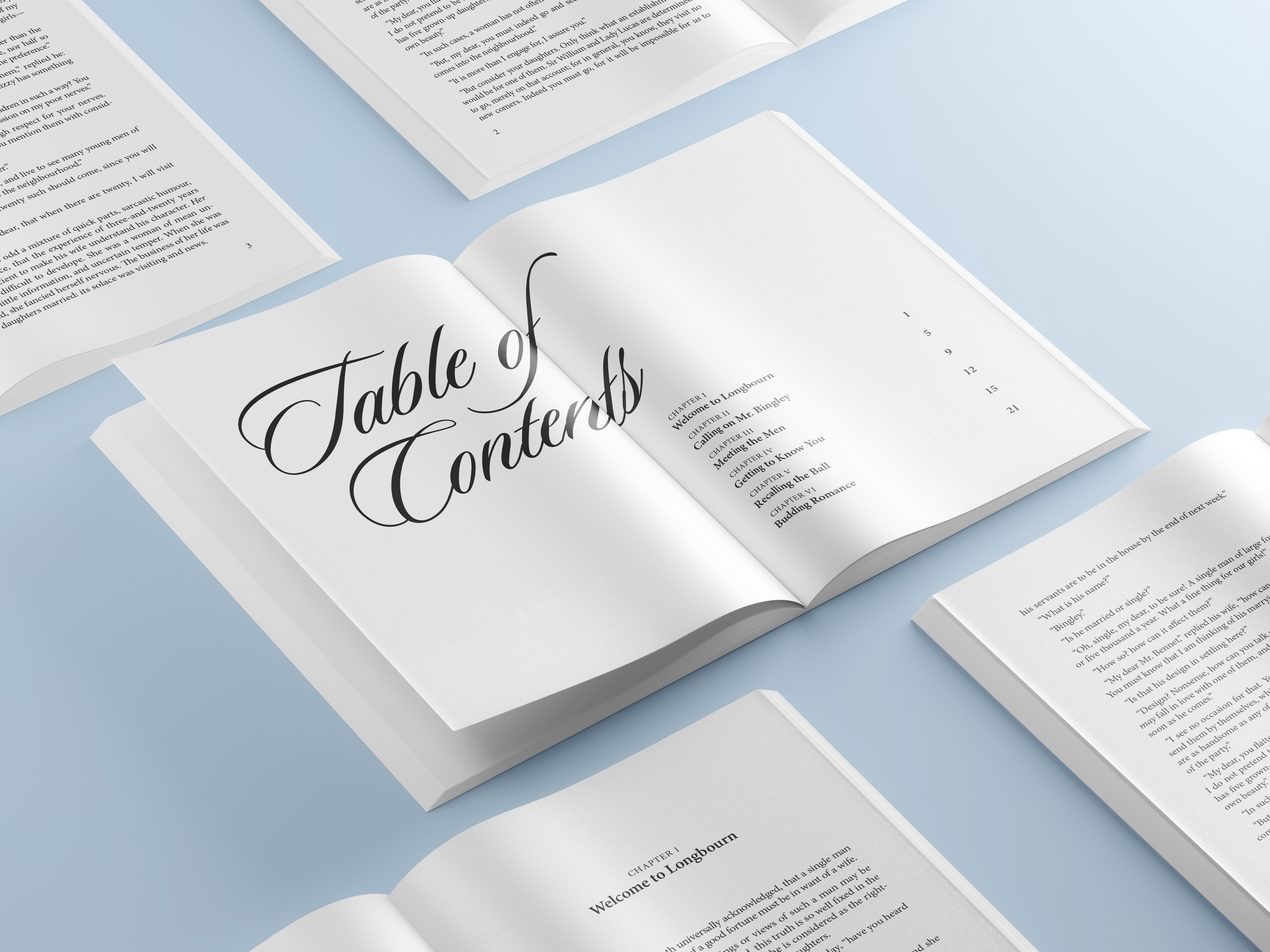
Designing the layout for an entire book also presented challenges I had not anticipated at first. There were many small details that required careful attention, such as spacing, typographic hierarchy, consistency across pages, and maintaining readability over long sections of text.
concept and inspiration
The concept of the cover is built around character symbolism through flowers. Each flower represents one of the Bennet sisters, reflecting their personalities, emotional traits, and roles within the family dynamic.
By bringing the flowers together in a single composition, the design mirrors how the sisters are both individuals and part of a collective narrative. The soft blue background and refined typography reinforce the elegance of the period, while the vibrant flowers introduce contrast, personality, and visual movement.
Design execution
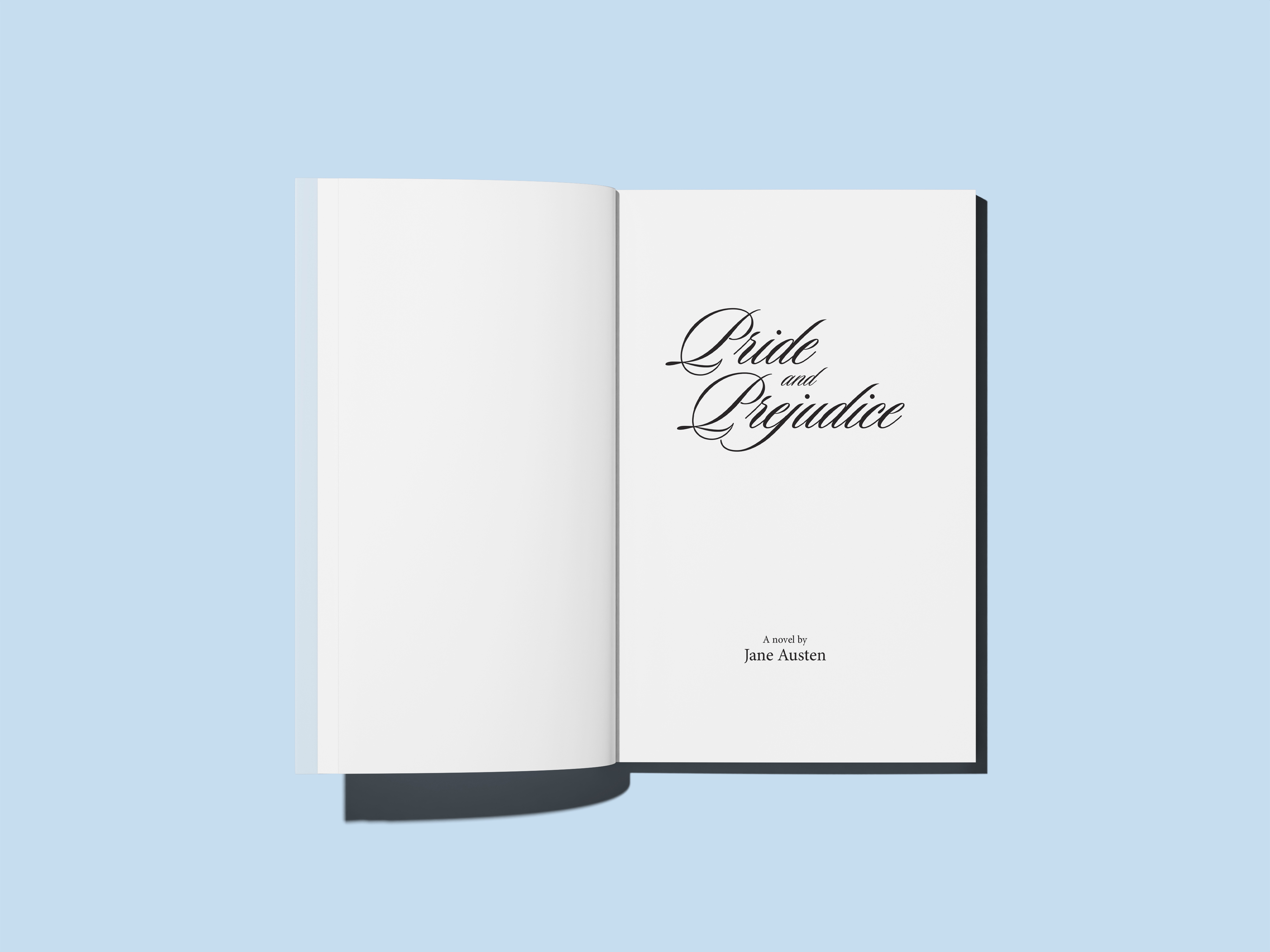
The execution focused on creating a design that feels both elegant and modern across the entire book, inside and out. I developed a cohesive visual system that connects the cover design with the interior layout, ensuring consistency in typography, spacing, and visual rhythm throughout the book.
approach
My approach began with analyzing the personalities and narrative roles of the Bennet sisters in the novel. Instead of illustrating characters directly, I explored symbolic representation as a way to express their differences while keeping the design elegant and timeless.
I researched botanical illustrations and historical visual references connected to the Regency era, while also considering modern editorial design. This helped me create a composition that feels connected to the world of the novel while still appealing to contemporary readers.
challenges
One of the main challenges of this project was finding the right balance between honoring the classic style associated with the novel and introducing a modern design approach. I wanted the book to feel timeless rather than overly traditional or overly contemporary.
Designing the layout for an entire book also presented challenges I had not anticipated at first. There were many small details that required careful attention, such as spacing, typographic hierarchy, consistency across pages, and maintaining readability over long sections of text.
concept and inspiration
The concept of the cover is built around character symbolism through flowers. Each flower represents one of the Bennet sisters, reflecting their personalities, emotional traits, and roles within the family dynamic.
By bringing the flowers together in a single composition, the design mirrors how the sisters are both individuals and part of a collective narrative. The soft blue background and refined typography reinforce the elegance of the period, while the vibrant flowers introduce contrast, personality, and visual movement.
Design execution
The execution focused on creating a design that feels both elegant and modern across the entire book, inside and out. I developed a cohesive visual system that connects the cover design with the interior layout, ensuring consistency in typography, spacing, and visual rhythm throughout the book.