works
works
Graphic Design
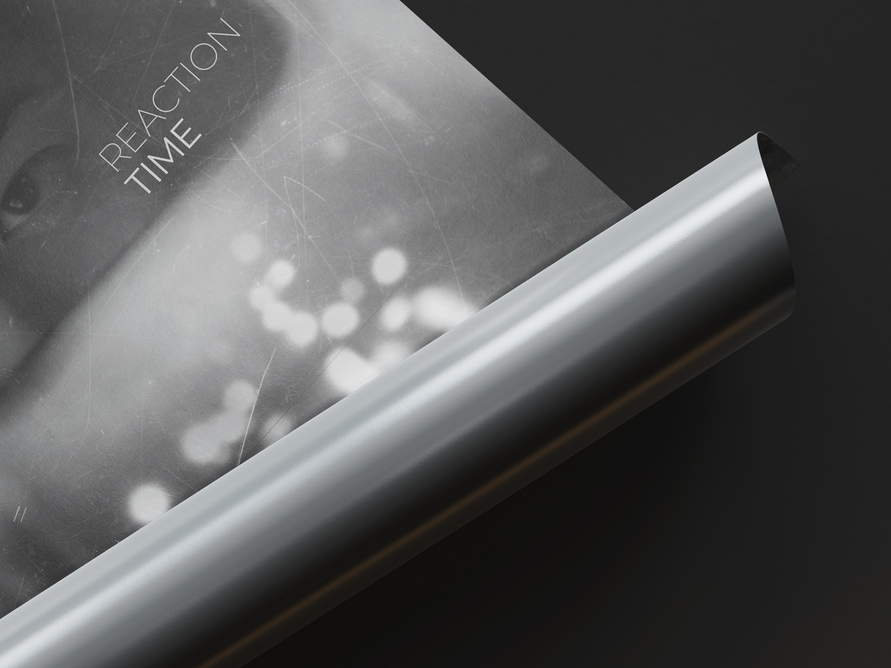
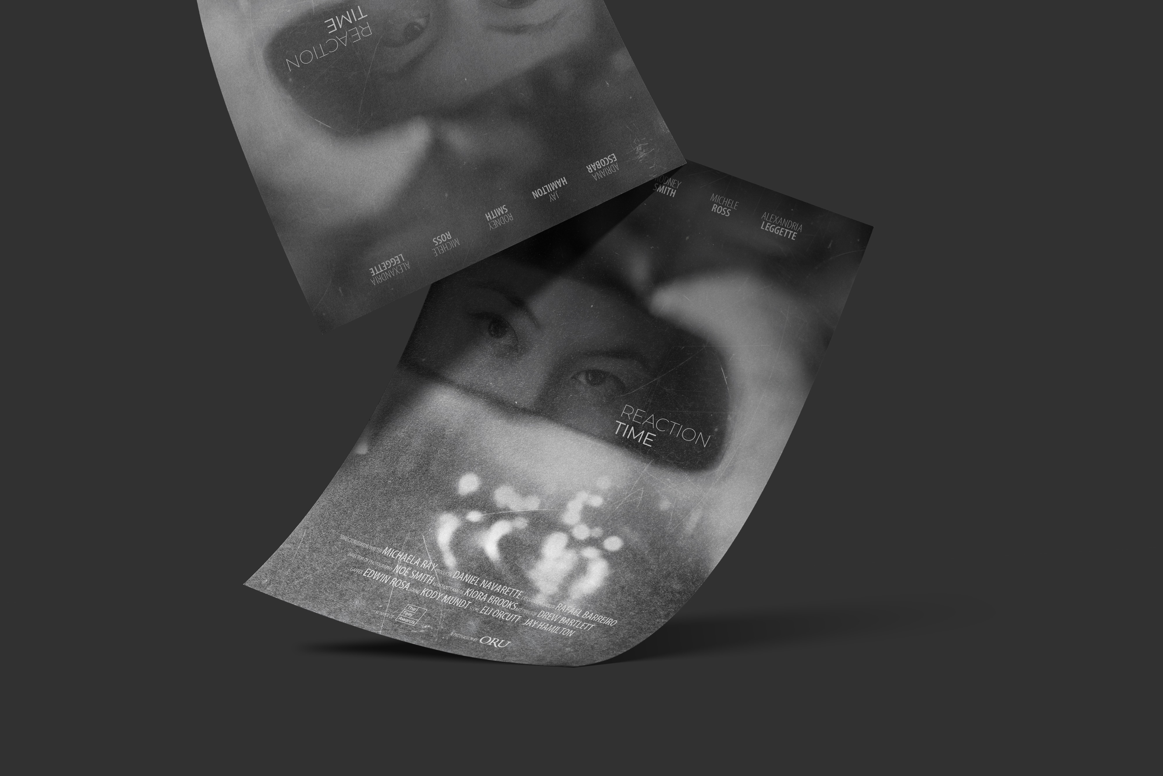
Reaction Time
This poster was created as a student project based on the short film Reaction Time, directed by Michaela Ray. The film follows a student who is dealing with the emotional aftermath of a life-changing incident.
Category
Graphic Design
year
2024

Project process
creative process
creative process
creative process
approach
My approach began with understanding the emotional tone of the film. Since the story focuses on trauma and memory, I wanted the poster to feel atmospheric rather than literal. I researched visual references involving blurred imagery and photographic compositions that evoke the sensation of a moment frozen in time.
From there, I explored how composition and focus could guide the viewer’s attention while still maintaining a sense of ambiguity and emotional depth.
challenges
One of the biggest challenges in this project was blending all the images used to create the final composition. Since the poster was built from several different photographs, each image had different angles, lighting conditions, and focal points.
Stitching them together in a way that felt natural and cohesive required careful adjustments to perspective, lighting, and texture. Balancing these elements while maintaining the emotional atmosphere of the poster was a key part of the design process.
concept and inspiration
The concept centers on memory, perception, and emotional tension. The blurred elements throughout the poster represent fragmented memories and the lingering impact of a traumatic moment.
At the center of the composition, the eyes reflected in the mirror create a strong focal point, suggesting awareness, vulnerability, and confrontation with the past. The limited color palette was intentionally chosen to reinforce the emotional tone of the film, conveying sadness and the feeling of a distant memory that continues to affect the character.
Design execution
The execution involved building the composition using multiple images layered together to recreate the atmosphere of the film. I intentionally kept much of the image blurred so that the viewer’s eye is guided toward the center of the poster, where the subject’s eyes become the primary focus.
Typography and layout were kept minimal to support the mood of the design while still presenting the film title and credits clearly. The overall composition was designed to feel immersive and slightly disorienting, reflecting the emotional state of the character in the story.