works
works
Graphic Design
Rumble Fish
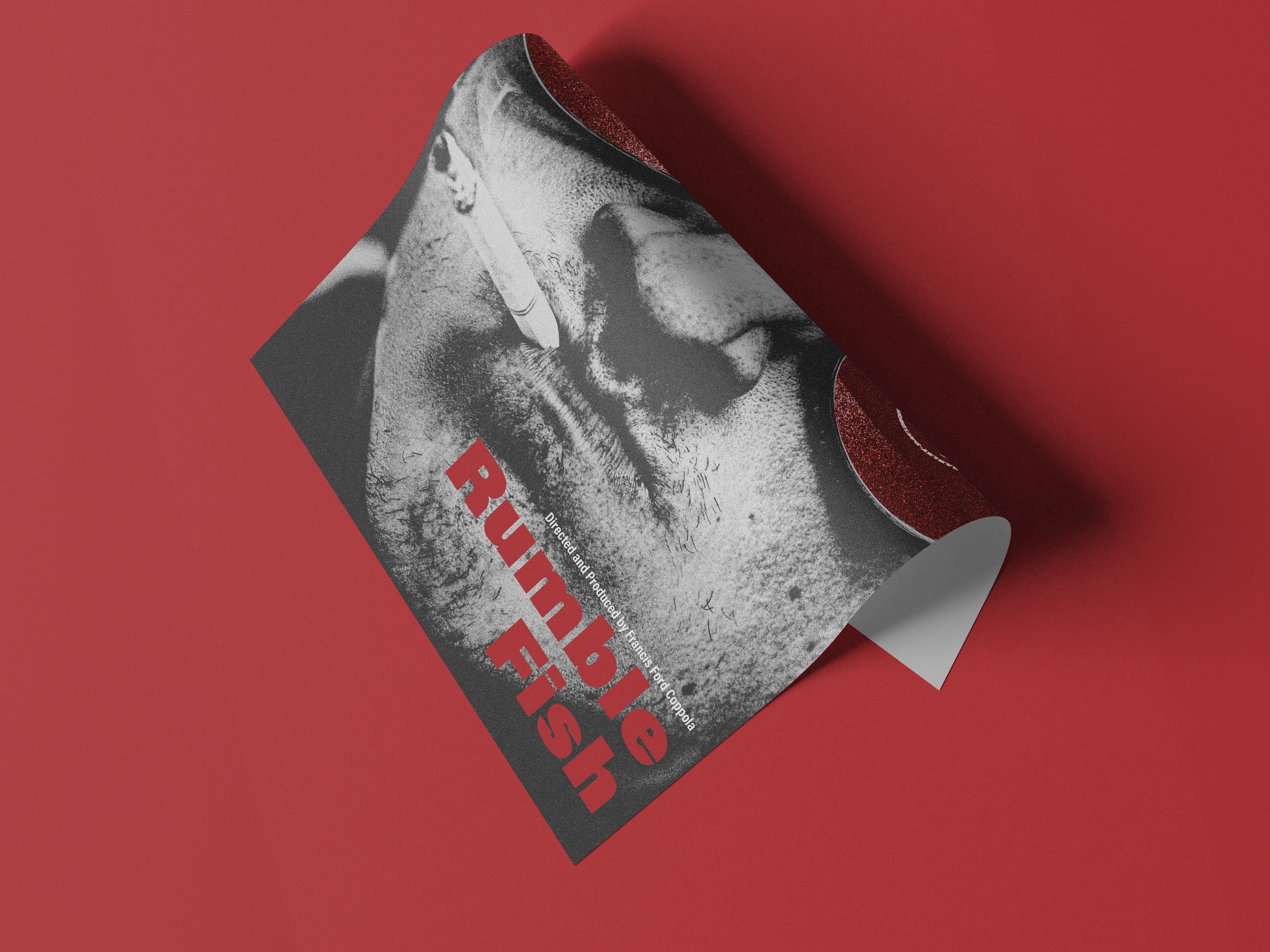
This project is a redesign of the poster for Rumble Fish, directed by Francis Ford Coppola.
Category
Graphic Design
year
2023

Project process
creative process
creative process
creative process
approach
My approach began with studying the visual language and key elements of the film. Since the movie is primarily presented in black and white, I decided to preserve this characteristic in the poster design to stay connected to the original cinematic style.
I also analyzed moments and objects from the film that could communicate its themes visually. By identifying symbolic elements within the story, I explored how they could be incorporated into a single composition that still felt clear and impactful.
challenges
The biggest challenge in this project was blending all of the meaningful elements together without overwhelming the design. Since the poster includes multiple symbolic references from the film, it was important to ensure that each element contributed to the story without making the composition feel crowded.
concept and inspiration
The concept centers on rebellion, identity, and symbolism. Because the film is mostly black and white, I chose to keep the poster predominantly monochromatic. In the film, one of the few strong moments of color comes from the red fish in the water tank, so I incorporated red accents into the poster as a visual highlight.
The imagery of the boy and the motorcycle was intentionally selected to reference the relationship between Rusty and his brother, the Motorcycle Boy. These elements help communicate the emotional and narrative tension of the film while reinforcing its bold and rebellious tone.
Design execution
The execution involved combining several visual elements from the film into a single cohesive composition. I worked with high-contrast imagery and texture to create a gritty and cinematic look that reflects the mood of the movie.
The red elements were carefully integrated into the design to stand out against the black-and-white palette while maintaining balance. Typography and layout were kept strong and minimal so that the imagery could carry most of the emotional weight of the poster.